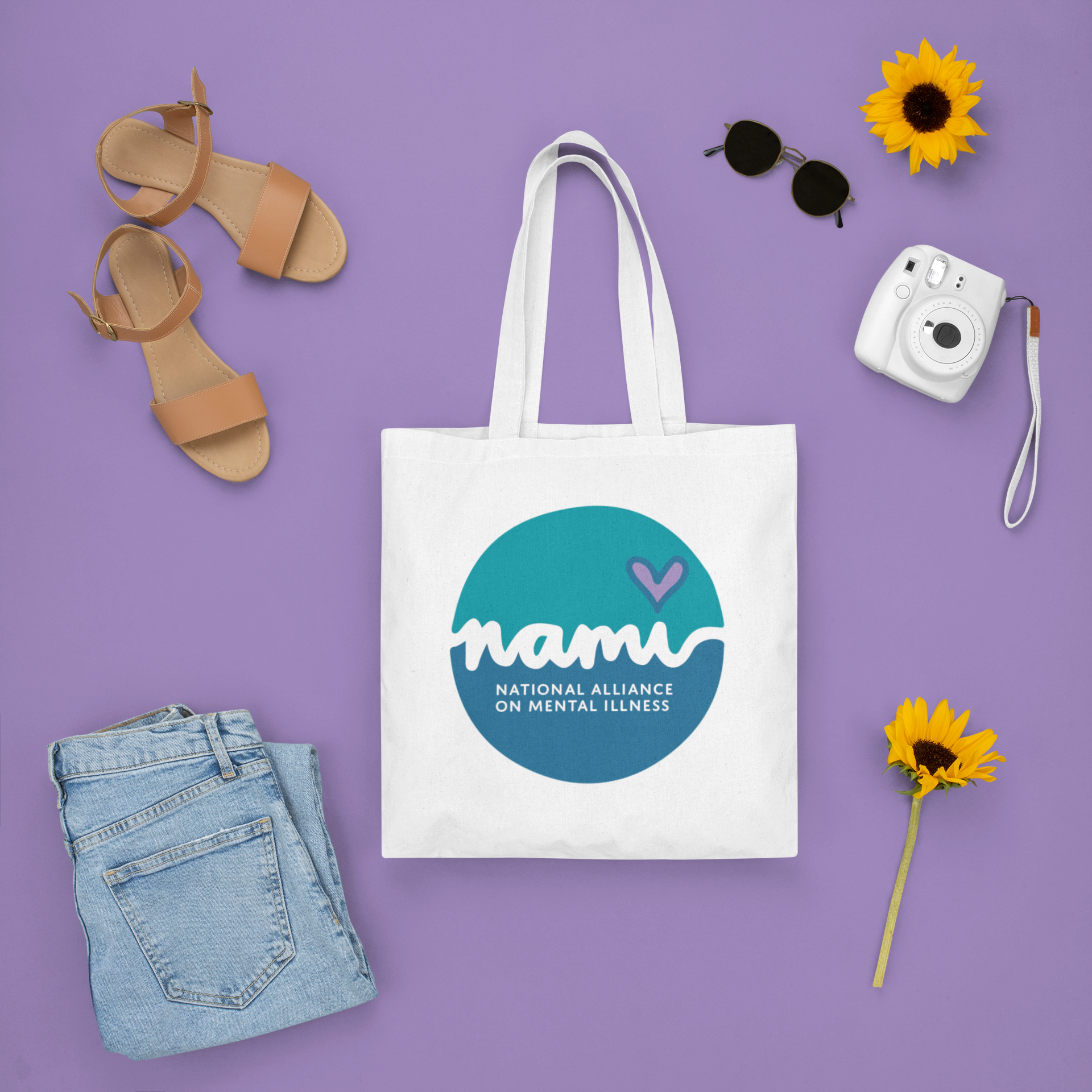
NAMI Logo &
Creative Process
This project is extra special to me because it is about mental illness. One of my best friends is bipolar and NAMI has been a big part of her life and because of her, NAMI is a big part of my life too!
I really thought their current logo could use some improvement. I wanted to go with something very calming due to the type of business it is representing. Therefore, I wanted to use colors true in nature to provide calmness, so I got my colors from the landscape and water photos in my mood board. You can see in my mood board, that I was going for a simple, spacious, serene style of logo.
Here, I start by showing you my mood board, then sketches, then final logos, followed by the logo on a sign and a mug. Here are all of my sketches maybe 150+? It takes many to get THE ONE! I used Procreate on my iPad to make 7 pages of my sketches. Then, I narrowed it down to top 2 designs and made a single page of sketches of each of those. Once I get the logo mastered in black & white, I can add the color appropriately and make everything fit just right!
This logo is original and custom because it uses my own personal cursive to create the name NAMI, as well as it includes my very own heart shape (demonstrating love & compassion). I feel this logo symbolizes NAMI very well especially with the curves the logo creates which are just as the up & down curves of a mental illness.


Made in Adobe Illustrator & Procreate.
Fonts: Suz’s Custom Script (Script in logo)
Domus Titling Semibold (text)
Colors: Teal#0193A2
Blue #146791
Purple #A281DA
